Total Pageviews

Tuesday 10 May 2011

Website Screenshots


Evaluation

Evaluation

1)
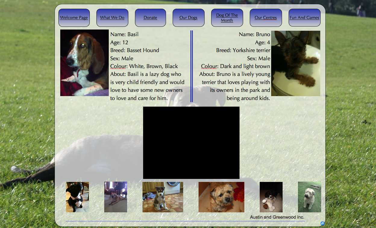
The final finished design of our website I think is a very aesthetically pleasing and professional. We achieved this by using professional websites to guide us in what to do. Many of them gave us new ideas, which in the end made the website much more appealing and usable to the consumer. One example of this would be the cruelty line. We saw this idea on the RSPCA website and thought it would a good addition to our website as it gives the option for a user to do their part for the charity. Another idea we had was that we saw many of the websites we visited had links to social network sites on it. Seeing as social networking sites are becoming increasingly popular this is a great way for the charities to communicate to the younger and older audience. The layout of our website was similar to a lot of the professional ones, although much more basic. Most websites had the links along the top of the page for easy access wherever you are, which the design we had selected for ours is. We made the choice of putting the donate button on most pages which would hopefully make the user of the website more likely to decide to donate towards the charity. The colours are very friendly colours. Blue and green take up the majority of the screen colour; they are both neutral friendly colours. The photographs we included were all of dogs. We tried to find the cutest ones we could as people are attracted to cute things more. This would increase the audience’s attention span and make them more interested in the topic at hand.

2)

My site will represent age. As it is a very modern site I believe that the majority of people using it would be the younger generation. Many aspects of my site reflect this; the modernised design being the main one. With my survey results I found out that most of the young generation like big bold colours with a modern feel to it. This gave me the idea of using it in my website.

3)
A media institute that might distribute my product might be Google. Google is one of the biggest and first search engines in the world. If Google was to distribute my product it would dramatically increase the number of hits on my website. It would also look good for Google, backing a charity is always good for the image of the company.

4) The audience for the website would be a wide range of people, from young to old. This is due to the fact it is very simple and easy to navigate around the site but with the modern feel and look of the it the website is up to date with the modernisation of websites today. Using the survey I found out that most young people are on the internet today, mainly using social network sites to communicate with their friends.  I went on these sites to do research and found out that they all very modern but also very simplistic. This gave me the idea to create a website that would be useable enough for the elderly but modern and eye catching enough to keep the attention of the younger generation.
5)
In a lot of the websites I visited to do research on, I found out that the use of bold colours and pictures really stands out and emphasises the how the website is presented. From this I decided that our website could indulge in these ideas. The background on every page is the image of a dog lying on grass. This relates back to our website as it is about dog care, but the colours used in the pictures make it stand out. The bright green of the grass with the dark black dog in the middle are two colours that stand out and make the user notice them. Our logo, a dog paw, is included on every page of the site. We enlarged it and made it so the users’ eye is immediately brought to it. This also relates back to the original idea of the website, dogs. Another idea we saw on several websites is when you roll over a link it changes colour. We used this idea in our website as we believed it was a good attraction. All of these additions we have put on the website are used to attract the audience and draw them into the website.
6)
When I created my first website I did not have a whole lot of knowledge on creating websites using iWeb, therefore my initial website was very basic and lacked in attention to detail. Because of this my final design of the website was not as I would of hoped it to be. During the creation of the main website I learnt a lot more range of skills which in the end added up to a much better looking and designed website.
7)
My two sites are both completely different. My main one looks very professional but my school website does not look as much. During the period of designing the main website I learnt a lot more new skills about designing websites. One of them being how professional websites are laid out and what attracts the audience.

Tuesday 5 April 2011

Style of website

What would the website contain

Order of preference (average)

Colour of website

Postcode of Interviewee

Religion of Interviewee

Job of Interviewee

Salary of Interviewee

Ethnicity of Intervieww

Gender of Interviewee

Age of Interviewee

Thursday 3 March 2011

Planning and preparation

This is the link to the page with everything for Planning and Preparation: this is 20% of your mark, ie two whole grades.
http://web.me.com/morrmedia/MORRMEDIA/Website_planning_and_preparation_list.html
Make sure everything is ticked off. There are also lists on the wall in the media room.
On Monday you should have shotlists, storyboard (for your video), survey completed, six annotated pages completed.
HM

Thursday 17 February 2011

Blog

Today we started planning our website. Me and charlie together brain-stormed ideas that we have a passion for.  We came to the conclusion that we want to base our charity on dogs. In particular the rehoming of the dogs. We choose this because it is a very current issue and is around us everyday. 


RSPCA- The rspca are devoted to the rehoming of all animals.
http://www.rspca.org.uk/allaboutanimals/pets/rehoming/petsearch?p_p_id=petSearch_WAR_ptlPetSearchPortlets&p_p_lifecycle=1&p_p_url_type=1&p_p_state=normal&p_p_mode=view&p_p_col_id=column-1&p_p_col_pos=1&p_p_col_count=2

Dog Trust- They devote all their time just to dogs and rehoming them.
http://www.dogstrust.org.uk/rehoming/searchcentres/westcalder/default.aspx?gclid=CP_FvvKUj6cCFUEY4QodBCf-cw

Dogsos- They devote all their time to the rescuing of dogs in particular. 
http://www.dogsos.co.uk/


All these web sites show a love for dogs and ensuring they go to the right home.  Each site has many pictures of the animals in question so try and persuade the customers to adopt. It gives lots of opportunities on the web site to adopt a dog as well.


We have decided to call our charity paw paws. This is a play on words related to dogs. 

Friday 28 January 2011

Research on 4 websites

Today we researched other school websites.

Xavier High School - http://www.xavierhs.org/s/717/start.aspx

Xavier High School is a private school located in New York.  The website is a pretty basic website with the main attraction in the centre of the website. Links across the top of the page take you to the different sections of the website. Below that there a photos that are on a loop of the students and the school. There is a small information box below that too, and on the side there is the recent news headlines.
Although this website is very basic it presents very well.

The Browning School- http://www.browning.edu/

The Browning is another private school whose website is much more detailed and professional. A large red banner across the top of the website attracts the user to that section. Several links are below that which are used to go to the different sections of the website. There is a photo loop below the links which has a continuos loop of photos of the school and its students. This website is much better than the first as it looks a lot more presentable.

Southbank International School- http://www.southbank.org/

The Southbank International school is a private school for international students. The school website is quite eye catching. A picture of big ben in the background and a light blue colour over that covers the whole screen. There are two small circles that contain pictures, which are constantly changing, of the international students. The slogan 'A school without walls' shows that the school is open to anyone and wont turn them down.  On the left hand side there is a small section of information about the school, with  some info about the upcoming events within the school.

St. Olaves School- http://www.saintolaves.net/

St. Olaves is a School in the London Borough of Bromley . The website doesn't seem to be very eye catching or appealing. With a gray, black and white background a slideshow plays in the middle of the website with pictures and quotes. Along the top of the page there are a load of different logos of companies that have been recognised by the school. There a few links that take you to the other sections of the website. Below that is the news, calendar and notices about the school.

Tuesday 25 January 2011

The list -

Hi Charlie
This is a list of the work you should have in place at the date of this post:

Creating your blog.
Using a camera introduction
Photoshop your picture/s and post to blog.
Research on four school websites: 400 words short essay.
Survey.
Catchup, including survey, annotated websites.
Draft brief for preliminary site.
Page layout.
Photoshop, first artwork.

You've got a bit more to do, but it's coming on OK.
HM

Unphotoshopped Photo

Original Photo

Monday 17 January 2011

17th January

In this lesson we selected one of the photos which we then edited on photoshop.

Friday 14 January 2011

14th January

In this lesson the class split into several groups. Each group was given a camera and was told to take two pictures of every person. One picture had to be serious and the other less formal. These pictures were then put on the shared area.

How to use a camera

  1. Today we were sent off with cameras to take pictures around the school. We had to a few pictures, one being one funny image and one serious image. We were given a few rules to follow when using a camera
    1. 1.If it looks bad, you are too far away.
    2. 2.Camera position is vital.
    3. 3.Use the rule of thirds.
      This is the photo I have chosen.


Thursday 13 January 2011

13th January

In this lesson we set up our blogspot accounts. We have set up these accounts in which to have a forum in which to post our work.